If you’re going to invest in professional family photography, then you should definitely make what you wear in your photos a priority.
Coordinating a color palette for a family photo shoot involves choosing colors that complement each other and suit the setting and season. Here’s a step-by-step guide to help you create a cohesive and visually appealing color scheme:
Consider the Location and Season:
Location: Think about where the photos will be taken. For example, beach photos might look great with blues, whites, and sandy neutrals, while a forest setting could be enhanced with earth tones.
Season: Choose colors that reflect the season. Pastels and light colors for spring/summer, and rich, deep tones for fall/winter.
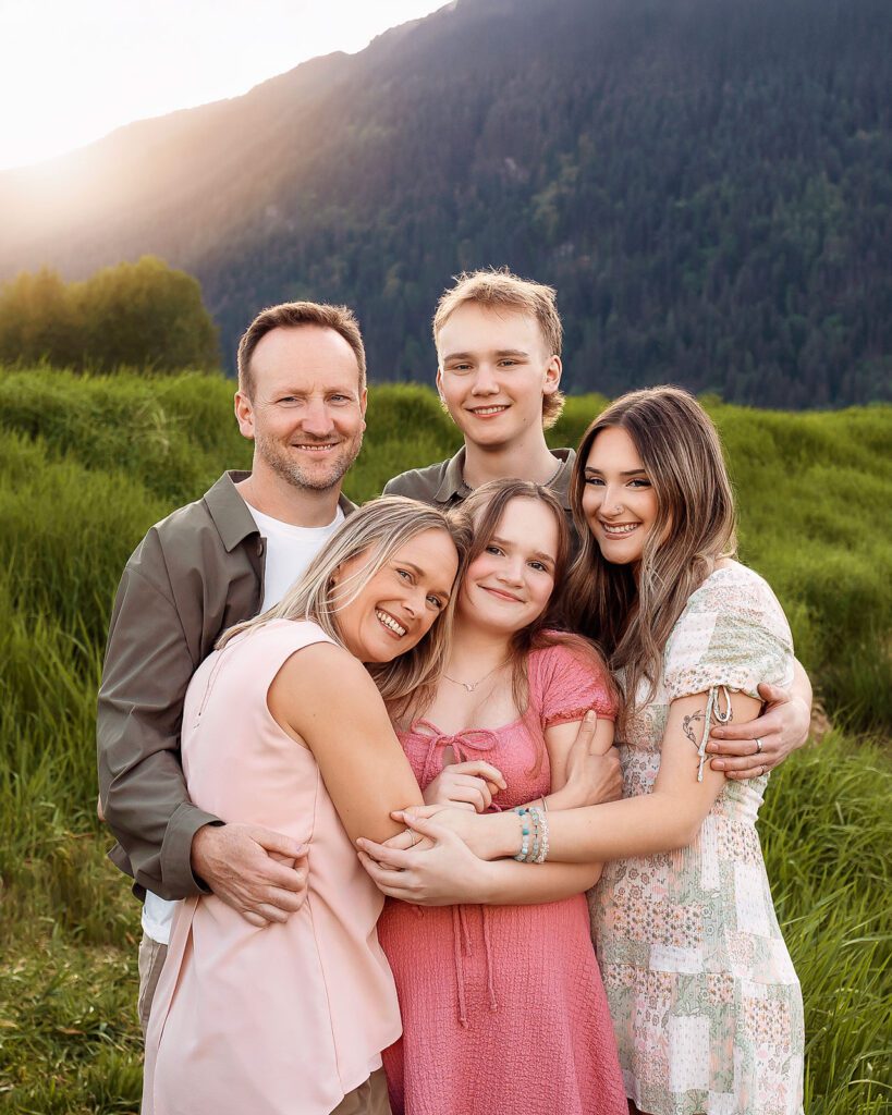
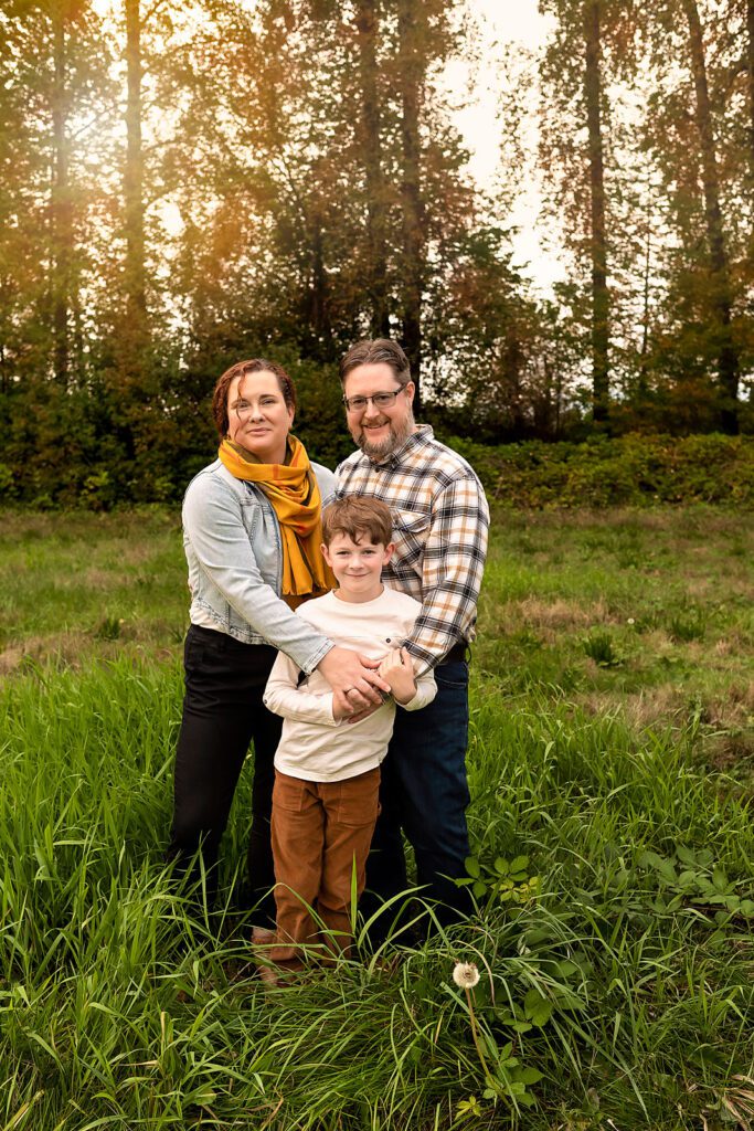
Colour: I find the easiest way to start wardrobe selection for a family is to start with 1 neutral colour like white, beige, gray, brown, black or navy. This will serve as the foundation of your palette and help tie everything together.
Next, pick 2-3 Accent Colors: Choose a couple of colors that complement your base color. For example:
- Blues and Whites: For a fresh, clean look.
- Earth Tones: Browns, greens, and rust for a natural, warm feel.
- Pastels: Soft pinks, blues, and yellows for a light, airy vibe.
Distribute Evenly: Ensure that each color in your palette is represented throughout the outfits. For example, if you have chosen navy, white, and mustard, distribute these colors among different pieces of clothing.
Vary the Intensity: Use different shades of the same color to add variety without straying from the palette.


Keep it Simple: Avoid large logos, busy patterns, or too many bright colors. Solid colors and subtle patterns are ideal.
Dress Comfortably: Ensure everyone is comfortable and can move freely. Uncomfortable clothing can show in the photos.
Layers: Adding layers like cardigans, vests, or scarves can add depth to your photos.
Patterns: Subtle patterns like stripes or small checks can add interest without being overwhelming. Ensure that patterns are minimal and do not clash.
Mix Textures and Fabrics: Combining different textures (like denim, knits, or lace) can add visual interest.


Visualize Together: Lay out all the outfits together to see how they look as a group. This will help you make adjustments and ensure a cohesive look.
Avoid Over-Matching: Aim for coordination rather than everyone wearing the exact same color. This creates a more natural and less forced appearance.
Accessories: Use accessories like scarves, hats, and jewelry to add pops of color and tie the outfits together.
Shoes: Ensure shoes are clean and fit the overall style and color scheme.
By following these steps, you can create a well-coordinated and visually appealing color palette for your family photo shoot. Contact me if you’d like me to review your outfit selections for your session with me or with any other questions you have.


